Increase engagement is essential now that half the emails and open via smartphones and tablets.
Email marketing is one of the channels most used by brands to boost your business, and even if many suggest that this channel could happen very soon fashion, the truth is that more and more email accounts and consumers continue to use them to daily.
Yes, how to access mail, for many, has changed. If before entering via computer, now access their emails directly from the smartphone, which is an advantage for email marketing, as many users receive notifications whenever you get a new mail, and access to them is much more right now.
In fact, the click-to-open rate of emails via mobile is getting closer computers, according to a new report Yesmail, outlined by Marketing Charts. This metric measures the percentage of clicks divided by the percentage of openings, and the bad news is that convergence is not so much because improve a device such as to worsen the other: it is true that the ratio of click-to-open from the mobile it has risen from 11% to 13% in just two years, but in that same period, the ratio via desktop has fallen from 22% to 15%.
Given that each time the mobile has more prominence when accessing mail (and in fact 49.2% of all emails opened in the last year occurred via mobile, compared to only 40.6% in previous) year is essential for companies to find out how to improve the aperture ratio and clicks from these devices.
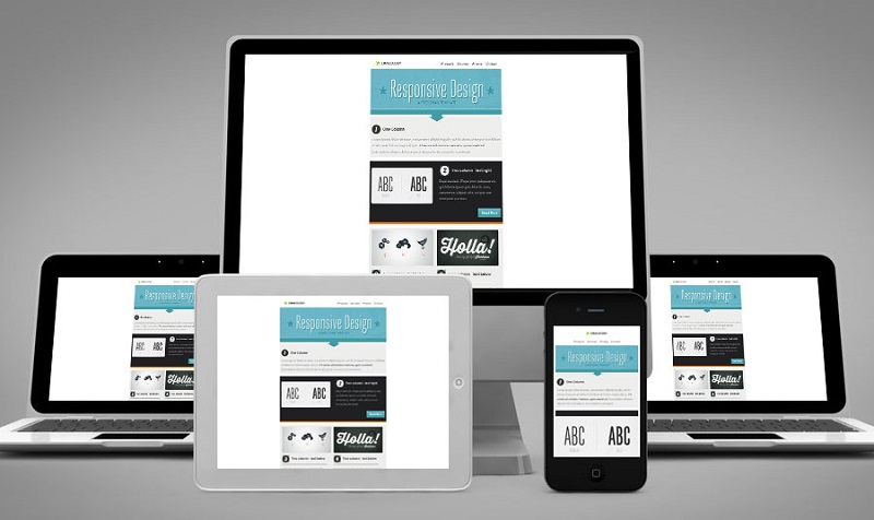
And in the report share one of the keys to achieving that greater engagement: bet on a responsive design. Because, in fact, a considerable percentage of users directly delete those emails that are not open properly.
To analyze the impact of responsive design in mobile engagement, Yesmail compared the performance metrics of the emails of those brands that using responsive design in all its communications (17% of the total) and those who never used (the 26.7% of the total). The conclusion was that bet on the design responsive compensates.
You may also like to read another article on Web-Build: 5 Tips For a Professional Website Design
In the emails that had adapted this design, there was a much higher percentage of emails that were opened from the mobile (57.2% versus 51.7% of non-responsive) and there was also a higher percentage of clicks from this device (58% vs 46.7%). But most interesting is that the ratio of click-to-open mobile via increased significantly among those with responsive design: 16.2% vs. 10.4%. Interestingly, among the emails received via desktop, the ratio of click-to-open was also higher in the emails of responsive design.
Increased number of emails does not mean less engagement
Another interesting fact is that this study contributes to sending a larger number of emails not necessarily a negative impact on the levels of user engagement, as is often assumed.
During the last quarter of 2015, for example, active subscribers (those who have opened or clicked on an email at least once in the preceding 90 days) received 10% more emails than the previous year and 15% more in 2013. However, the percentage of openings increased from 48% to 55% in that same time frame, and click-through rate also increased by 17%.
It is thus shown that a greater number of emails not saturates users, but we must take this statement with great caution and remember that for this to be so emails should be personalized and relevant because many studies show that consumers they have less patience with increasingly they consider spam emails.


+ There are no comments
Add yours