
Nature has always been a powerful teacher for designers. Among the most elegant natural structures is the spider web. This intricate creation offers valuable lessons for building effective navigation systems. By studying how spiders construct their webs, designers can create user-friendly pathways that guide visitors seamlessly through digital spaces.
Understanding the Spider Web Structure
Spider webs are masterpieces of efficiency and purpose. Each strand serves a specific function. The radial threads provide structural support, while the spiral threads capture prey. Similarly, a well-designed navigation system should have primary pathways that support the entire structure and secondary links that catch user interest.
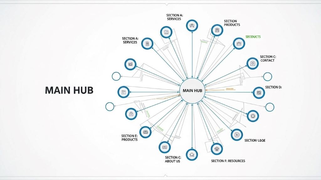
The web’s central hub connects to all other parts. This creates a clear hierarchy. Users should always know where they are and how to return to the starting point. Therefore, applying this principle means placing your most important content at the center of your navigation structure.
Core Principles of Web-Inspired Navigation
Multiple Pathways to the Same Destination
Spiders create redundancy in their webs for strength and functionality. Likewise, your navigation should offer users multiple ways to reach important content. For example, a product page might be accessible through the main menu, a search function, category pages, and related product links.
This approach accommodates different user behaviors. Some people prefer browsing through categories. Others use search bars. Additionally, some users follow recommendations. By providing various routes, you ensure everyone can find what they need.
Radial Organization from a Central Point
The spider web radiates outward from its center. Your homepage or main dashboard should function similarly. All major sections should connect directly to this central hub. This creates a spoke-and-wheel pattern that users intuitively understand.
From the center, users can quickly access any major area of your site. Furthermore, they can easily return to the starting point. This reduces frustration and improves overall user experience.
Interconnected Secondary Pathways
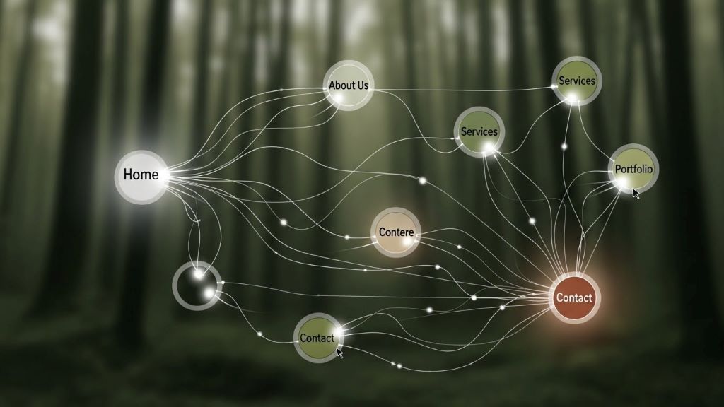
Beyond the main radial structure, spider webs have spiral connections. These link the radial threads together. In navigation design, these represent cross-links between related content. For instance, a blog post about web design might link to articles about user experience, color theory, and typography.
These connections help users discover relevant content they might not have searched for initially. However, too many cross-links can overwhelm visitors. Balance is essential.
Practical Implementation Strategies
Creating Clear Visual Hierarchy
Spider webs are immediately recognizable because of their distinct patterns. Your navigation should be equally clear. Use size, color, and positioning to indicate importance. Primary navigation items should be larger and more prominent than secondary options.
Consistent placement also matters. Most users expect navigation menus at the top or left side of pages. Breaking this convention without good reason can confuse visitors. Therefore, stick to familiar patterns unless you have compelling reasons to innovate.
Implementing Breadcrumb Navigation
Breadcrumbs are perfect examples of web-inspired design. They show users exactly where they are in the site’s structure. Like following a thread back to the web’s center, breadcrumbs let users retrace their steps easily.
This feature is particularly valuable for large websites with deep hierarchies. According to research on user behavior patterns, breadcrumbs reduce the number of actions needed to navigate to higher-level pages. Consequently, they improve efficiency and user satisfaction.
Designing Intuitive Menu Structures
Your main navigation menu represents the web’s radial threads. Keep it simple and logical. Group related items together. Use clear, descriptive labels that match user expectations.
Mega menus can work well for complex sites. They reveal multiple levels of hierarchy at once, similar to seeing the entire web structure. However, they require careful organization. Otherwise, they become cluttered and confusing.
Building Responsive Touch Points
Spider webs vibrate when prey touches any part. The spider immediately knows where to go. Your navigation should be equally responsive. Interactive elements should provide immediate feedback when users hover or click.
Loading indicators, color changes, and smooth transitions all communicate that the system is working. These small details build user confidence. Additionally, they make the experience feel more polished and professional.
Mobile Navigation Considerations
Spider webs adapt to their environment. Your navigation must do the same across different devices. Mobile screens present unique challenges. There is less space for displaying menu options.
The hamburger menu has become a standard solution. However, consider hybrid approaches. Show the most important navigation items permanently. Hide secondary options behind a menu button. This gives users immediate access to key features while keeping the interface clean.
Touch targets on mobile devices should be large enough for easy tapping. Small, closely-packed links frustrate users. Therefore, ensure adequate spacing between clickable elements.
Testing and Refinement
Spiders constantly maintain and repair their webs. Similarly, navigation systems require ongoing attention. User testing reveals problems that designers might miss. Watch how real users interact with your navigation. Note where they get confused or stuck.
Heat maps and analytics provide valuable data. They show which navigation elements users click most often. Consequently, you can optimize placement and prominence based on actual behavior rather than assumptions.
A/B testing different navigation structures helps identify the most effective approach. Try variations in menu organization, labeling, or placement. Measure results carefully. Small changes can significantly impact user engagement and conversion rates.
Accessibility and Inclusivity
Every user should be able to navigate your site effectively. This includes people using screen readers, keyboard navigation, or other assistive technologies. Proper HTML structure and ARIA labels ensure compatibility with these tools.
Color alone should never convey meaning. Users with color blindness need alternative indicators. Additionally, provide skip links that let keyboard users bypass repetitive navigation elements.
Text should be readable and links clearly identifiable. Sufficient color contrast helps users with visual impairments. According to web accessibility guidelines published by major organizations, these practices benefit all users, not just those with disabilities.
Common Mistakes to Avoid
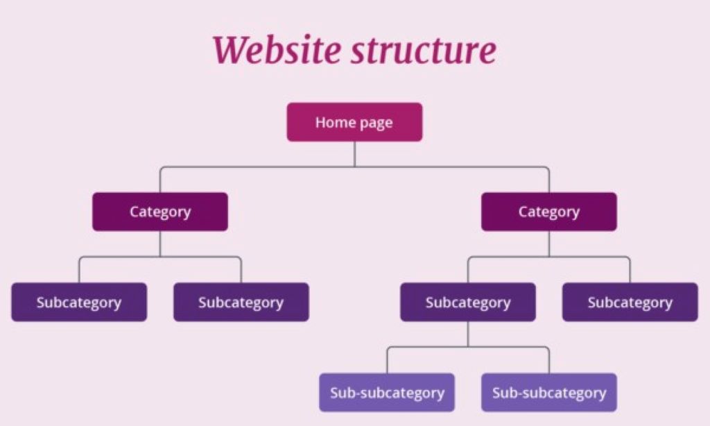
Deep hierarchies bury important content. If users must click through five levels to find what they need, your structure is too complex. Flatten hierarchies when possible. Important information should never be more than three clicks away.
Inconsistent navigation confuses users. If your menu changes dramatically between sections, visitors feel lost. Maintain consistent navigation across your entire site. However, you can add contextual sub-navigation when needed.
Overloading menus with too many options creates decision paralysis. Users cannot process dozens of choices simultaneously. Group items logically. Use progressive disclosure to reveal details only when needed.
Conclusion
Spider webs demonstrate remarkable efficiency and elegance. By applying their organizational principles to navigation design, you can create intuitive systems that serve users effectively. Remember the key concepts: establish a clear central hub, provide multiple pathways, create interconnections between related content, and maintain consistent patterns throughout.
Like a spider tending its web, continuously monitor and refine your navigation. User needs evolve, and your structure should adapt accordingly. Therefore, invest time in testing and improvement. The result will be a navigation system that guides users smoothly toward their goals while supporting your business objectives.
Frequently Asked Questions
What is the main advantage of web-inspired navigation design?
The primary advantage is creating multiple interconnected pathways that accommodate different user behaviors. This redundancy ensures users can find content through various methods, improving overall accessibility and user satisfaction.
How many main navigation items should a website have?
Most experts recommend limiting main navigation to seven items or fewer. This follows cognitive psychology principles about working memory. However, the exact number depends on your content and user needs.
Should mobile and desktop navigation be identical?
Not necessarily. Mobile navigation should prioritize essential items due to space constraints. However, all content should remain accessible on both platforms, even if accessed through different pathways.
How often should navigation systems be updated?
Review your navigation quarterly based on analytics and user feedback. However, avoid making changes too frequently, as users need consistency. Only update when data clearly indicates improvements are needed.
What role does search play in web-inspired navigation?
Search serves as an alternative pathway, similar to a spider sensing vibrations from any web point. It allows users to bypass hierarchical navigation entirely. Therefore, robust search functionality complements structural navigation rather than replacing it.
Related Topics:
The Importance of a School Having a Well-Designed Website
Does the design of your site not good? 5 reasons to change it!


Leave a Reply