Like fashion, web design is constantly changing trends and fashions that come and go. When it comes to creating a website that a professional impression, you will do well to keep it fresh and within the trends. After all, when you go to an interview, you do not want to look your best?
If your answer is “Of course” then here in Web-Build info we share with you 5 tips for web design to always remember…
1. Keep it clean and easy to use
The world around us has become a bit messy and the web is no exception. Ads, banners, icons, logos, signs, pop-ups, buttons, etc. – Sometimes everything can be a bit heavy. So why not give your visitors a break from all the noise and clutter? Cover things like the flat design and the blank can do wonders with the experience of site visitors. Try to keep all simplistic or even minimalist with only the most important content on the surface. Sometimes less is really more.
2. Do some field reconnaissance?
If you’re reading this blog, you are on the right track. But you can take your research a step further and start looking at the web sites for a specific purpose: to find out what you like about them and what does not.
Take some notes on what you like to emulate in your own site. Do you think a page long scroll work well with your site? Perhaps the focus really admire someone has used to develop its contact page. It can be something as small as the imitation of the use of an arrow icon that points to an important message.
Whatever it is that you find attractive, think how you can make it work in the design scheme of your own website.
3. Use the visual hierarchy
Visual hierarchy, you can do I repeat? It is a term that basically means that our eyes pay attention to the web space to a certain pattern – a pattern that can help you optimize the important content on your site. For example, if you create a button “Register now”, you may want as many people as possible they click on it and continue through the registration process.
The visual hierarchy tells us that the eyes move from top to bottom, left to right (One tip: The human brain reads content such as Z).
This means you will have the most eyes on the button in the upper left corner of your site, and those eyes could well mean more clicks. Remember; only include your most important content in these spaces. If you put too much in one place the visitors will be overwhelmed and not get the result you are aiming.
4. Make your text easy to read
The text is important. It is there to provide information and answer questions even before they have done. With that said, do not make your readers have to squint your eyes to read it. There are some simple rules that you can attach that will make you and your texts are clear.
Make sure your colors match: For example: colored text on a white background perhaps will give your site visitors a headache; he will give up and perhaps leave. None of these results are desirable – so make sure that you check all of the text readable.
Do not use a very small font size: While it may look cute, and as in the relationships, the look is not enough. Make sure your readers will not need a magnifying glass to understand your message.
Keep your sources: Your website can not be more than three sources – most two could be even better. For more points, make sure you choose fonts are easy to read and do not let your visitors wonder if you are reading Sanskrit.
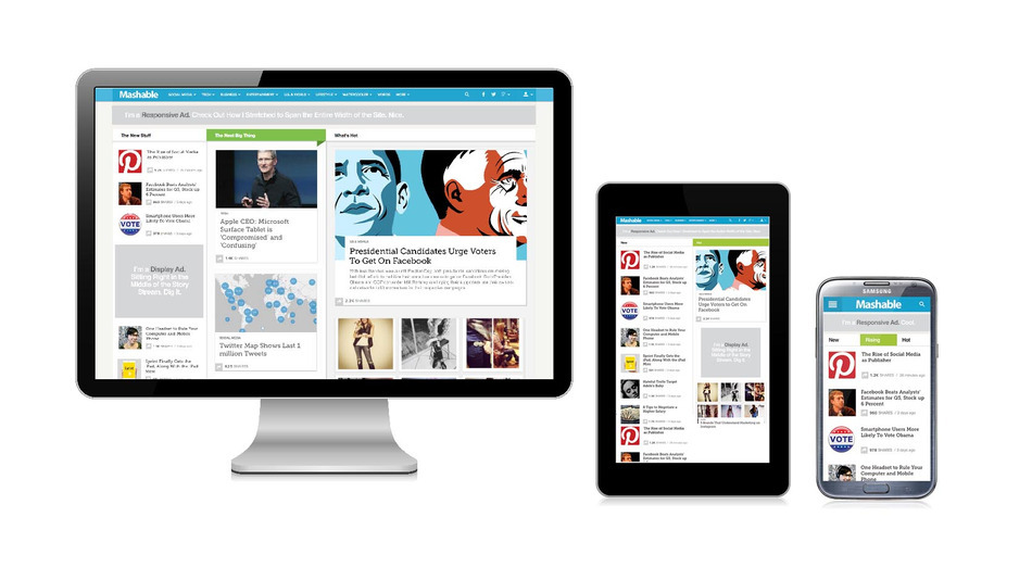
5. Get the most out of the mobile version of your site
What good is a website professional looking if not professional looking on mobile devices? In today’s world, anything. Do not despair! The experienced website builder comes fully equipped with an intuitive mobile editor and is ready to be used to their full potential.
Make changes to keep all the above tips in mind and switch between the editor and the preview version so you can see the changes put into action. After all, you do not want to miss potential site visitors / users / clients just because they are on the subway and away from a computer, right?


+ There are no comments
Add yours