Imagine walking into a library where books are scattered randomly. No signs. No categories. No logic. You’d leave in frustration—just like 88% of online visitors do when they land on a poorly structured website. Your site’s architecture isn’t just about looks. It’s the invisible hand guiding users to what they need while telling search engines what matters most.
A chaotic website structure costs you more than just visitors. It sabotages your website structure SEO, buries your content, and tanks your conversions. Research shows that 76% of consumers say the most important factor in a website’s design is ease of use (HubSpot). Yet, most businesses overlook this critical element, focusing on aesthetics over functionality.
This guide reveals how to build a site architecture that delights users and dominates search rankings. You’ll discover the psychology behind intuitive navigation, real-world examples from industry leaders, and actionable steps to transform your site into a conversion machine. Whether you’re launching a new site or revamping an old one, these principles will keep visitors engaged and search engines impressed.
The Psychology of Website Navigation: Why Users Leave (or Stay)
First Impressions Are Made in Milliseconds
Users decide whether to stay or bounce in 0.05 seconds (Google). A confusing menu or cluttered layout triggers an instant exit. Your site’s structure must answer three questions immediately:
- Where am I?
- What can I do here?
- How do I find what I need?
Example: Apple’s website uses a minimalist menu with six clear options. Each click leads deeper into a logical hierarchy.
The “Three-Click Rule” Is a Myth—But Efficiency Isn’t
Contrary to popular belief, users will click more than three times if the path feels intuitive. However, 44% of shoppers will abandon a purchase if the process is too complex (Baymard Institute). Every extra click adds friction.
Solution: Organize content so users reach their goal in the fewest steps possible. Amazon’s mega-menu groups thousands of products into broad categories first.
Cognitive Load: The Silent Conversion Killer
The human brain processes visual information 60,000 times faster than text (3M Corporation). Overwhelming users with choices paralyzes decision-making. Simplify navigation by:
- Limiting top-level menu items to 7 or fewer.
- Using descriptive labels (e.g., “Running Shoes” instead of “Products”).
- Grouping related items under parent categories.
Case Study: REI increased conversions by 12% after simplifying their navigation from 20 to 8 main categories.
The 5 Pillars of a High-Converting Website Structure
1. Flat vs. Deep Architecture: Which Works Best?
A flat architecture keeps all pages within 1–3 clicks of the homepage. This improves crawlability and user experience. However, sites with hundreds of pages (like e-commerce stores) need a deep architecture to avoid clutter.
Best Practice: Use a hybrid approach. Keep essential pages shallow. Nest less critical content deeper.
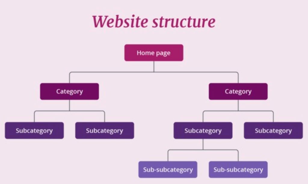
2. Logical Hierarchy: The Backbone of Your Site
Your homepage should link to major categories. Those categories link to subcategories or individual pages. This pyramid structure distributes link equity and boosts SEO.
Example:
Homepage → Products → Men’s Shoes → Running Shoes → Nike Air Zoom Pegasus
3. Internal Linking: The SEO Powerhouse
Internal links guide users and search engines to important pages. They also pass authority from high-traffic pages to newer content. Pro Tip: Use keyword-rich anchor text (e.g., “best running shoes for beginners”).
4. Consistent Navigation Across All Pages
Your menu, footer, and breadcrumbs should appear on every page. Consistency reduces confusion and builds trust. Zappos places their search bar, menu, and footer links in the same spot on every page.
5. Mobile-First Navigation: Non-Negotiable in 2026
Over 60% of web traffic comes from mobile devices (Statista). Hamburger menus, sticky headers, and thumb-friendly buttons are essential. Test touch targets—buttons should be at least 48×48 pixels.
Step-by-Step Site Architecture Guide for Maximum Impact
Step 1: Start With User Research
Use tools like Hotjar or Google Analytics to see how visitors interact with your site. Identify:
- Pages with high bounce rates (indicating confusion).
- Popular search terms (revealing what users want).
- Drop-off points in the conversion funnel.
Example: A SaaS company discovered users struggled to find pricing. They moved the “Pricing” link to the main menu and saw a 25% increase in signups.
Step 2: Map Your Content Into Categories
Group related topics into pillars. For a fitness blog, pillars might include:
- Workouts
- Nutrition
- Gear Reviews
- Success Stories
Each pillar becomes a main menu item. Subtopics (e.g., “Home Workouts”) live under their respective pillars.
Step 3: Create a Visual Sitemap
Tools like Slickplan or MindMeister help visualize your structure before building it. Share the sitemap with your team to spot gaps or redundancies.
Step 4: Optimize URL Structure for SEO
URLs should reflect your hierarchy and include keywords. Bad: yoursite.com/page1?id=123. Good: yoursite.com/running-shoes/nike-pegasus-review.
Step 5: Implement Breadcrumb Navigation
Breadcrumbs (e.g., Home > Products > Shoes) improve usability and SEO. They show users their location and provide easy backtracking. Bonus: Google displays breadcrumbs in search results, increasing click-through rates.
Step 6: Design for Scannability
Users scan pages in an F-pattern (Nielsen Norman Group). Place critical elements (CTAs, key links) where eyes naturally land. Use:
- Short paragraphs
- Bullet points
- Subheadings with keywords
Step 7: Test and Iterate
Use A/B testing to compare navigation layouts. Tools like VWO or Optimizely track which version performs better. Example: A travel site increased bookings by 18% after moving their “Deals” link to the top-right corner.
Real-World Examples of Flawless Website Structure
Example 1: Airbnb
Why It Works:
- Simple 5-item menu (Stays, Experiences, Online Experiences, Host, Help).
- Search bar dominates the homepage—aligning with user intent.
- Filters narrow results without overwhelming users.
Example 2: HubSpot
Why It Works:
- Mega-menu organizes hundreds of resources into logical groups.
- Sticky header keeps navigation visible while scrolling.
- Breadcrumbs appear on all blog posts.
Example 3: Nike
Why It Works:
- Visual menu icons (e.g., a sneaker for “Shoes”) speed up recognition.
- “New Releases” and “Sale” links cater to urgent shoppers.
- Footer links to customer service, sizing guides, and store locator.
How Website Structure SEO Boosts Rankings
1. Crawlability: Helping Google Find Your Pages
A clear hierarchy ensures search engines discover and index all your content. Pro Tip: Submit your sitemap to Google Search Console.
2. Topic Clusters: The Modern SEO Strategy
Group related content under a pillar page. Link all cluster pages back to the pillar. This signals to Google that you’re an authority on the topic.
Example: A marketing agency creates a pillar page on “SEO Strategies.” Cluster pages cover “Keyword Research,” “On-Page SEO,” and “Link Building”—all linking back to the pillar.
3. Page Authority Distribution
Internal links pass authority from high-ranking pages to newer ones. Prioritize links to your most valuable content (e.g., product pages, lead magnets).
4. Reduced Bounce Rates
A logical structure keeps users engaged longer. Google interprets this as a signal of quality, boosting rankings.
Case Study: A B2B company reduced bounce rates from 65% to 40% by reorganizing its blog into topic clusters.
Common Website Structure Mistakes (And How to Fix Them)
Mistake 1: Overloading the Menu
Too many options paralyze users. Fix: Limit main menu items to 5–7. Use drop-downs for subcategories.
Mistake 2: Orphan Pages
Pages with no internal links are invisible to search engines. Fix: Audit your site with Screaming Frog. Link every page from at least one other page.
Mistake 3: Inconsistent Naming Conventions
Using “Products” in the menu but “Our Offerings” in the footer confuses users. Fix: Standardize labels across your site.
Mistake 4: Ignoring the Footer
The footer is prime real estate for links to legal pages, contact info, and secondary navigation. Example: Moz’s footer includes links to their beginner’s guide, blog, and tools.
Mistake 5: Hiding Critical Pages
Buried contact or pricing pages frustrate users. Fix: Link to essential pages in the header, footer, and contextually within content.
Expert Tips for a Future-Proof Site Architecture
Tip 1: Plan for Scalability
Your structure should accommodate growth. Use CMS platforms like WordPress or Shopify that support easy expansion.
Tip 2: Prioritize Accessibility
Ensure your site works for all users:
- Add alt text to images.
- Use high-contrast colors.
- Enable keyboard navigation.
Tool: WAVE evaluates accessibility compliance.
Tip 3: Leverage Heatmaps
Tools like Crazy Egg show where users click, scroll, and drop off. Use this data to refine your navigation.
Tip 4: Monitor 404 Errors
Broken links hurt UX and SEO. Use Google Search Console to find and fix 404s promptly.
Tip 5: Update Regularly
As your business evolves, so should your structure. Review your sitemap quarterly to add new content and retire outdated pages.
FAQs About Website Structure and Navigation
1. How many menu items should my website have?
Aim for 5–7 top-level items. Too few limit options; too many overwhelm users.
2. What’s the best way to organize a large e-commerce site?
Use a hierarchical structure with broad categories (e.g., “Electronics”) leading to subcategories (e.g., “Laptops”) and finally to individual products.
3. Do I need a sitemap?
Yes. Submit both XML sitemaps (for search engines) and HTML sitemaps (for users) to improve crawlability.
4. How do I fix a poorly structured website?
Audit your current structure with Screaming Frog. Identify orphan pages, broken links, and confusing paths. Redesign with user journeys in mind.
5. Should I use a hamburger menu on desktop?
No. Hamburger menus hide navigation and reduce discoverability on desktop. Reserve them for mobile.
6. How does site structure affect conversions?
A clear path to conversion (e.g., Homepage → Product Page → Checkout) reduces friction. Example: An optimized checkout flow can increase conversions by 35% (Baymard Institute).
7. What’s the role of breadcrumbs in SEO?
Breadcrumbs improve crawlability and user experience. Google may display them in search results, increasing click-through rates.
Related Topics:
Conclusion: Your Website’s Structure Is Your Competitive Edge
A well-structured website doesn’t just look good—it works harder. It guides users effortlessly, satisfies search engines, and converts visitors into customers. Website structure SEO isn’t a one-time task. It’s an ongoing strategy that adapts as your business grows.
Your next steps:
- Audit your current site structure for usability and SEO gaps.
- Create a visual sitemap and test it with real users.
- Implement changes and monitor performance with analytics.
Ready to transform your site? Share your biggest navigation challenge in the comments—or book a free audit with our UX experts to get a customized blueprint!


+ There are no comments
Add yours