We have listed for you ten rules or advice that we feel we can give you to build a successful website. Obviously, every project is a work in itself, but these general rules (all equally important beyond their position) are the basis for a professional job. The links we give are examples of very useful material that you will find on the net.
#1- The site for users, not for you
If it is true that the site is yours and in a sense have to like, always remember that if you want to work, have to like it even more to your users.
A corporate website or at least a site not fully staff must put primary objective is to obtain a result that, in most cases, will make known or sell something. To achieve this, the site must please your users and they have to find useful. This is important to keep in mind. So, if the profit depends on the content, the pleasant depends on its appearance. Then choose a suitable layout to your site and not just like you, as well as colors that should be subject to strict rules. Try to follow the web design trends by visiting the actual sites and taking a cue from them. Do you need to have clarity, ease of navigation and reading, consistency between the pages of the site and between the site and any other campaigns of your company (leaflets, brochures, logo and colors). Emphasize the winning points of your product and the most important information; otherwise everything will seem the same. Pay attention to the language: do not take anything for granted when you turn to a wide audience; try to be rather more accurate when you turn to trained users.

#2- Design your site on paper
Thinking about the content or the content made before procured an idea of what you’ll have to fill the site.
The first step to effectively create a site is to design it and this means, even before you get to computer, collect ideas and content that will shape the site itself. To do this you just need a piece of paper and the time to answer some questions. The first is: “What do I get from the site? What I can offer users?” All your efforts will go in the direction of the answers you gave to these initial questions. The contents of the site and its navigation depend on it.
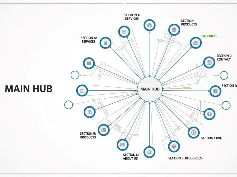
Divide the material you have retrieved or that you plan to use in groups, each of them will be a section of your site, then an entry in the top-level menu.
Create three, maximum four five groups will help you build a proper structure of the site. Similar material must not be joined, but divided into depth. The most suitable structure for managing content on a website is called inverse pyramid. The most general contents are the few top-level pages immediately visible to all users. More specific content instead go to the second level to deepen the individual sections so that interested users to be found anywhere.
Also ask yourself “How will manage the site?” If you think you can update it often makes sense to use both internal sections such as News in homepage, otherwise forget it. If you know that the site will tend to become more and more rich, think from the beginning to make it scalable so that you will not find you at some point, not knowing where to put things. If you have feedback (of evidence) by users, it is crucial for you, put much in evidence the contact page, your emails, use commendable pages.
#3- Invest on the contents
A beautiful site is visited only once, a site full of interesting information frequently.
The content is the main part of a site that, as we said, must be done to manage them, find them, put them in evidence. Spend time to prepare original or interesting content and you will not regret. You’ll grow your site and its visitors. I like content to the search engines, even more so when they are fresh, so if you update it often. Thanks to your content may also be able to get links to your site, that the web is a valuable commodity.
So you write about what you know, write and link all that may be inherent to the subject of your site; also uses images and video, if needed. If you sue someone, shows the sources also by linking to. Make a good selection of useful links and put it on the site.
#4- The menu is important
Without a well-organized menu, to find out the content of your site becomes difficult. It is not solved by putting everything on the home page.
Be careful to avoid some common mistakes:
1) The names, if the name of the pages is not sufficiently indicative of its contents, you risk you feel confused and find it difficult to navigate. You do not have to guess what it will contain the page, but understand it even before opening it. But nothing too long names or compounds.
2) Cataloging is not easy, but if you have to, for example, a product catalog, try to follow the most famous sites or follow the conventions generally adopted (by product, by brand, alphabetical, for characteristics etc. etc.).
You may also like to read another article on Web-Build: Web Design: 30 Tips to Improve Your Website
#5- In just a few colors, few fonts
Do not overdo it with the colors, choose a few (three, at most four) and adequate. With fonts, even less.
A website must be easy to read and pleasant, so you have to choose colors and fonts with care:
Colors: apply the common psychology of colors rules, so if a site should be professional, better cold tones as blue, gray, some green. For a personal website or particularly lively, then you can use the red, yellow, loads more colors. The text is better in black on white or always well contrasted. Unwrapped almost always in an institutional site the black background. Do not mix warm and cool colors and do not overdo it: three colors are enough.
Font: the most readable screen are so-called sticks, linear, opposing for serif fonts created for printing. Belong to the first is the family Arial, Verdana, Tahoma. They are pardoned the famous Times or Georgia.
#6- Nothing special effects
A professional website should not surprise users, but give them what they want. If for some time we have tried to impress the user, even without cause, now we try to respect it. Put long and heavy animations or music started when the site no request is unprofessional.
If you put video, audio, animations useful, then they will give an extra value to the site, or better left alone.
#7- Short texts and suitable for the web
Online is hard to read, and we know that the user is only a few seconds on a page.
Think of bringing the web texts born for the paper or other media is making a mistake. Web says otherwise, it said in general little and quickly. So, short texts and well studied. Well made headlines can attract the user. Summaries or brief introduction are useful. Further information and external links can be much more useful if grouped at the end of the text.
Like good graphic styles: putting in bold (bold) the most important terms, try to create a rich sense of the text to be read at a glance. Nothing underscores please, are reserved for the link. Leave white space, not crammed texts. Do not put too many things (text, links, and images) on the same page. All these things together transform your texts into good texts for the web.
#8- Beware images
A beautiful picture is worth a thousand words, even in the internet. However, do not overdo it, there are rules to follow to optimize an image on the web.
Do not forget that the images weigh in terms of kilobytes, so make the time to download a page longer. If you want to use an image, sooner rather optimize it, or reduce it to a size suitable to the page where you upload and in a compressed format such as .gif or .jpeg.
Different speech when it comes to icons and graphics created for the web that often, over to weigh very little, they are useful for navigation and understanding of the site.
Finally, a copyright notice: although technically it is easy, it is not true that we can legally take possession of every picture that we find on the net. Each published work, save precise indications in the opposite direction; it is in fact protected by copyright. If you want to use it, get permission. Many photos that might come in handy is collected in so-called Stock Photo sites, collections of images sold or given under specific copyright rules, but often freely usable for non-commercial purposes.
#9- Active yourself
If your site is finished and is online, the job is not finished. Now you have to make it known. In order to get visitors to your site you have basically two ways: go and look or you find from them.
Go find your users. Or advertises your website online and offline where you are sure to find the most interested users. So: Specialty sites, news groups, blogs for what is online, fairs, events, magazines for what it is offline. Participate in online conversations, post comments, answer in forums, in short, tries to be active.
Get found. You can do a lot of details being careful, investing a lot of time on your site. Parts of choosing an address (url) easy to remember. Put textual content often, this really like to search engines. Submit your site to the engines. Make many outbound links from your site to other related, maybe they reciprocate. Check referrers to your site from the statistics.
#10- Harness the potential of the Web
Internet is a medium of communication and as such should be treated. If you know it, you can exploit it.
The value of a site depends on its content. If you give users a reason to hold yourself useful source of information, they will put it to your favorites, will not fail to go and see the news, you will link, will recommend your site to friends. Try to get feedback, feedback, opinions and comments. Tries to involve them and give them talking points. Internet gives you these possibilities, it gives you space to put all the content you need, gives you the ability to update frequently.


+ There are no comments
Add yours