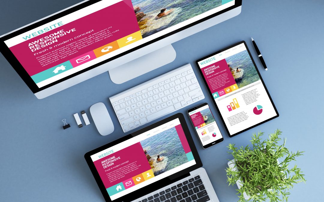
If the design of your website – or your blog – is not perfect, it is very likely that one of the following two things is happening to you. The first: if you are a brand or an SME, you are losing opportunities to do business. Translated: potential customers run away from your site because it does not give you sufficient guarantees about your reliability. The second: if you are a professional who is on the net to do personal branding or you are a marketer who has set the goal of earning online, you are giving a very bad image of yourself and you are not taking care of your interests.
To make a long story short: the design of a site or a blog is essential to achieve the goals you want to achieve from your online presence. Every web design error affects your credibility and your ability to do digital marketing that allows you to get good results.
The blog of Red Website Design has published an infographic – click the image above to see it in full – dedicated to those who have created a website that is worthwhile from the point of view of design. In it, five indications are presented on what is important to keep under control.
So here are the precautions to be put in place so that your online projects do not suffer damage due to a wrong web design …
1) One of the vital parameters for a website is the speed of loading its pages. More precisely: the loading time of the pages of your site or of your blog plays a fundamental role in influencing the user experience of your visitors.
For example, the statistics cited by the infographic indicate that 40% of web users leave a page that takes more than 3 seconds to load. The average time that visitors to a website are willing to wait for its pages to load is only 2,078 seconds.
As can be seen from the data subsequently reported in the infographic, the increase in web traffic on a site is related to the speed with which its pages are loaded. This also has a reflection on the rebound frequency: slower web pages actually have a high bounce rate.
2) The colors you choose to use on your website have an impact on the results you will get with the site itself. More precisely: the infographics explains that the green is connected to a 3% increase in traffic, while the traffic loss of 1.35% can be linked to red!
Among other things, we are told that sites with a dark color scheme have 2% more web traffic. On the other hand, those that have a layout with a combination of light colors show a smaller increase in online traffic, estimated at 1.3%.
3) What else to say about website layouts? The infographics starts from the fact that web users read the pages by drawing an F with their eyes. In addition, we are told that the layouts developed horizontally push visitors to a reading in Z – see directly the infographic to understand the exact direction along which people’s eyes move.
It’s not over here. Users of a site focus on the first two paragraphs of the page content – and that’s why on the web it’s best to use the inverted pyramid method. There are also online readers that simply scan the subtitles and bullets or numbered lists of contents. Specifically, 70% of Internet users look at bulleted or numbered lists, while 55% watch lists that are not bet.
4) The design of a website has a strong impact on determining visitor trust. In this sense, as many as 94% of people who surf the web cite the bad design of a site as a reason enough to have little confidence in the content they will find on the site. So, how is it possible to increase the perceived authoritativeness of an online project? In five ways, according to the infographic …
- Increasing the number of links to authoritative sources.
- By showing the company logo on the pages of the site – this is a sign that the company puts its face – and indicating which are the main customers of the company.
- Showing how many followers and how many fans have company profiles on Twitter and Facebook. (We are trying to impress visitors with numbers).
- Avoiding to publish images that are of repertoire, i.e. photographs or drawings that do not give real added value to the contents. For example, I refer to the abused photograph of the girl in the call center with the headphones on her head.
- Avoiding ready-made templates. (You need at least a minimum of customization!).
5) Sites that use HTML 5 have great advantages, even in terms of a greater number of pages viewed, which can even double compared to when it was not used!
Therefore, predictably, the infographics is aimed at webmasters and advocates the adoption of HTML 5 as soon as possible.
Here, these are basically the five reasons why change the design of your website or your blog, if it sucks. I recommend: think well! If you leave it as it is, you can say goodbye to your personal branding, lead generation, online sales strategies, etc.
At this point, turn the ball to you. What are, according to your experience in the field, the most serious errors that a professional or a company can commit in the web design inherent in their online projects? In practice: with what other points could the list that I published continue?


+ There are no comments
Add yours