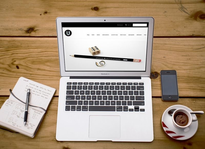
Today I want to talk to you about how to improve your website design making it professional, eye-catching, clear and usable. All these fine words are the starting point id to ensure that your site will be appreciated from the point of view of graphics and is as clear as possible to your readers. In web design, some of these are fundamental principles. I added my own experience as a web designer to classic fundamental because I believe that these unwritten rules can help to improve navigation and clarity of your website.

Here all the details…
Logo and Tag Line
- Clearly shows the name of your site, using a readable logo;
- Connects the logo to the home page, clicking on the logo the reader should be able to get to your home page;
- Use an original logo, in line with the theme of your site;
- Add a representative image by the logo. If you put your face, even better;
- Make the logo clearly visible and not hide it in the middle of the graphic: the reader must remember who you are;
- Use a line Tags: Enter, right next to the logo, a few words that summarize clearly the content of the site.
Top of the site, or “above the fold”
- First impact: Just landed on the site you must understand immediately what it’s about: make immediately available your best content;
- Order: Do not put too much at once visible content; choose a few of the best.
Menu
- Use the sections in the Main menu: Make clear navigation using a few well-defined sections;
- It facilitates navigation: Makes it easy for your visitors find links to the pages you want in just a few clicks;
- Make visible the link Contact: Doing so is evident on every page, make always visible even your phone number if your company has a website;
- Enter a Link About: Make it easy to find who you are;
- Make visible the Subscribe link: This link must be always visible, especially in pages that require registration, such as forums.
- Make the reader understand where he is: Highlight with a breadcrumb or graphics section of the site where the navigator is.
Design
- Targets design: Think of a pleasing graphic from your niche. For example, if you talk about comics, use a style that recalls the balloon graphics.
- Minimize the use of graphics: Be lighter on your site with graphics to make it beautiful to look at, rather focus on content.
- Watch out for “newsboys”: Do not put too many images, animations or too many links, make your reader confused;
- By air: Use white space, that leaves space between the texts and images, including an article etc …;
- Use a logical order in the layout: Enter the information in a logical page, so that all content is where it is expected that they can be found;
- Avoid flash graphics: You personally do not recommend it, if you can delete it or plan a way to blow it up
- Avoid horizontal scrolling: Make sure your design is not too large in both displays also skilled on monitors with a resolution of 1024 by 768.
- Test your site in different resolutions and on different browsers: The 1024×768 resolution should definitely be supported.
You may also like to read another article on Web-Build: Top 5 Specifics of a Quality Web Design
Images
- Optimizes the weight of the images for faster loading of your site, but be careful not to compromise on quality;
- Avoid using text in images: It is not seen by search engines and can safely be replaced by actual text or a link;
- Use graphic file names understandable: If your image is a cat and not write cat.jpg or f9030rr.jpg
- Use the Alt Text: Choose the alternative texts to your images with the “alt” tags and “title”. In this way, while images are loaded the reader will already know what to expect and your photos will be visible to the search engine.
Text
- Use a font size of at least 13 pixels: make sure not to use too small font in the body of your text, not all of your readers are young teenagers who do not struggle to read small text;
- He also thinks the new monitors in high definition that increasingly shrink the text font of your site and verifies the readability of text on different resolutions;
- Pay attention to the contrast: make sure your text is easy to read and in contrast with the background. Use a solid color behind the text.
- Use the same colors and fonts on all your pages consistently.
These are my tips to improve your website’s design. You’re using them?


+ There are no comments
Add yours